Designing loud interfaces that still respect the user
Loud and usable aren't opposites. The trick is deciding — ruthlessly — what gets to shout, and making everything else stand at parade rest.

Marlo Vane
Chronicle Studio
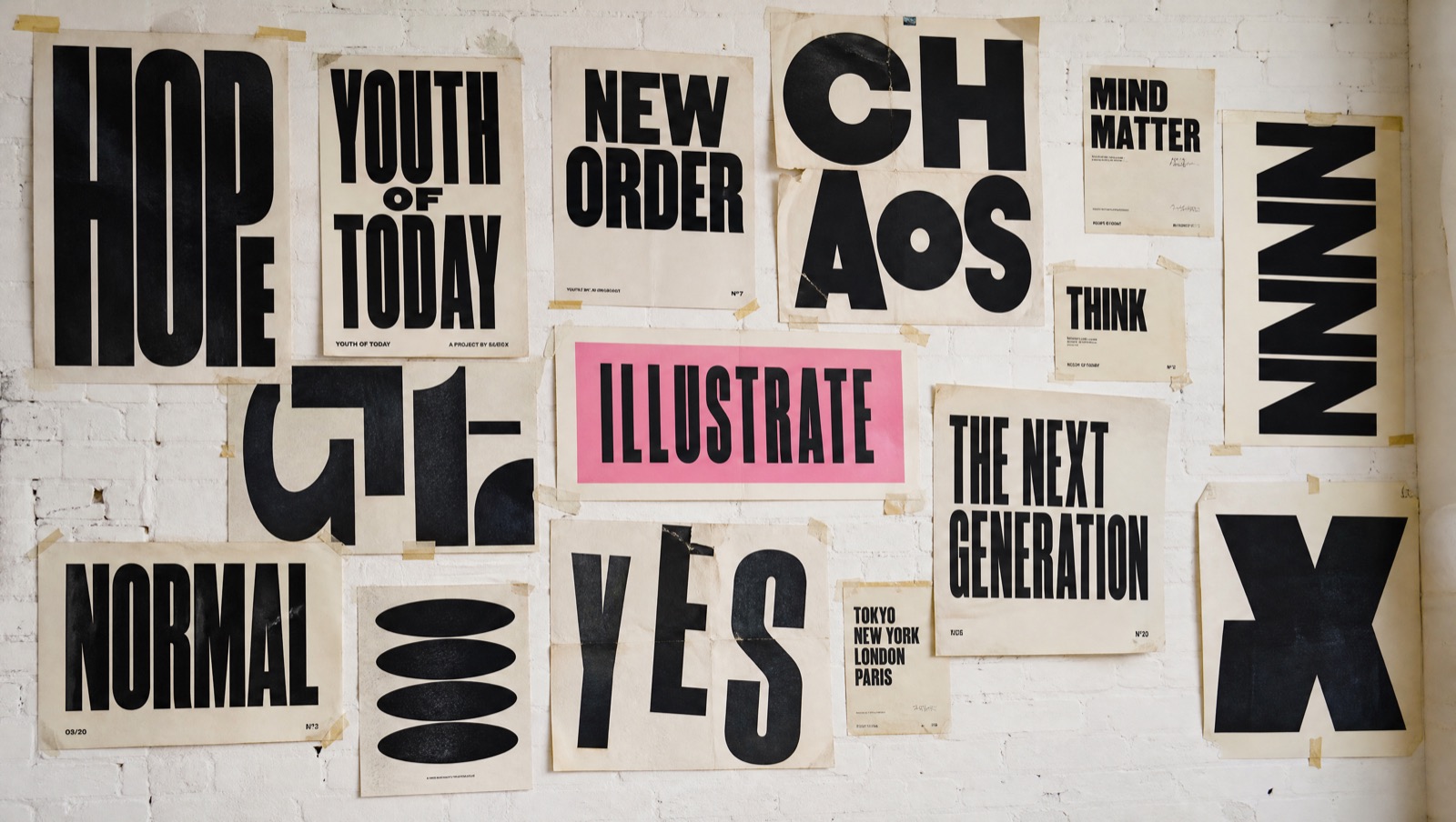
Every few months a client says the same sentence to me: we want it bold, but not too much. What they're really asking is whether loudness and usability are enemies. They aren't — but the peace treaty has terms.
Loudness is a budget
A page can afford roughly one scream, two raised voices, and unlimited murmurs. The scream is your headline or your accent block. The raised voices are section openers and primary actions. Everything else — body copy, borders, metadata — should be set at conversational volume so the loud parts land.
The failure mode isn't boldness. It's uniform boldness: when everything is capitalised, boxed, and pink, nothing is. Brutalism without hierarchy is just noise with a grid.
Three rules I actually follow
- One sticker per viewport. A rotated pill, a hard shadow, a marquee — pick one per screenful and let it own the moment.
- Hairlines are free, fills are expensive. Ink borders give structure without weight. A filled block is a spent bullet; make it count.
- Type does the acting, layout does the directing. If a layout trick and a type choice can achieve the same emphasis, choose type — it survives every screen size.
Loud design isn't the absence of restraint. It's restraint spent all in one place.
Respect is in the defaults
The quiet parts are where users learn to trust you: honest focus states, real contrast ratios, motion that respects the reduced-motion flag, tap targets sized for thumbs and not for mockups. Get those boringly right and you've earned the right to be weird everywhere else.
That's the whole trade. Discipline underneath, mischief on top.
Enjoyed this? There's more where it came from — read the journal or start a project.